A job posting tells a candidate what the role requires. It rarely tells them anything about why they should want it. For a role you are struggling to fill, or a graduate program pulling in thousands of applicants for a few dozen seats, that gap is where good candidates drop off before they ever apply.
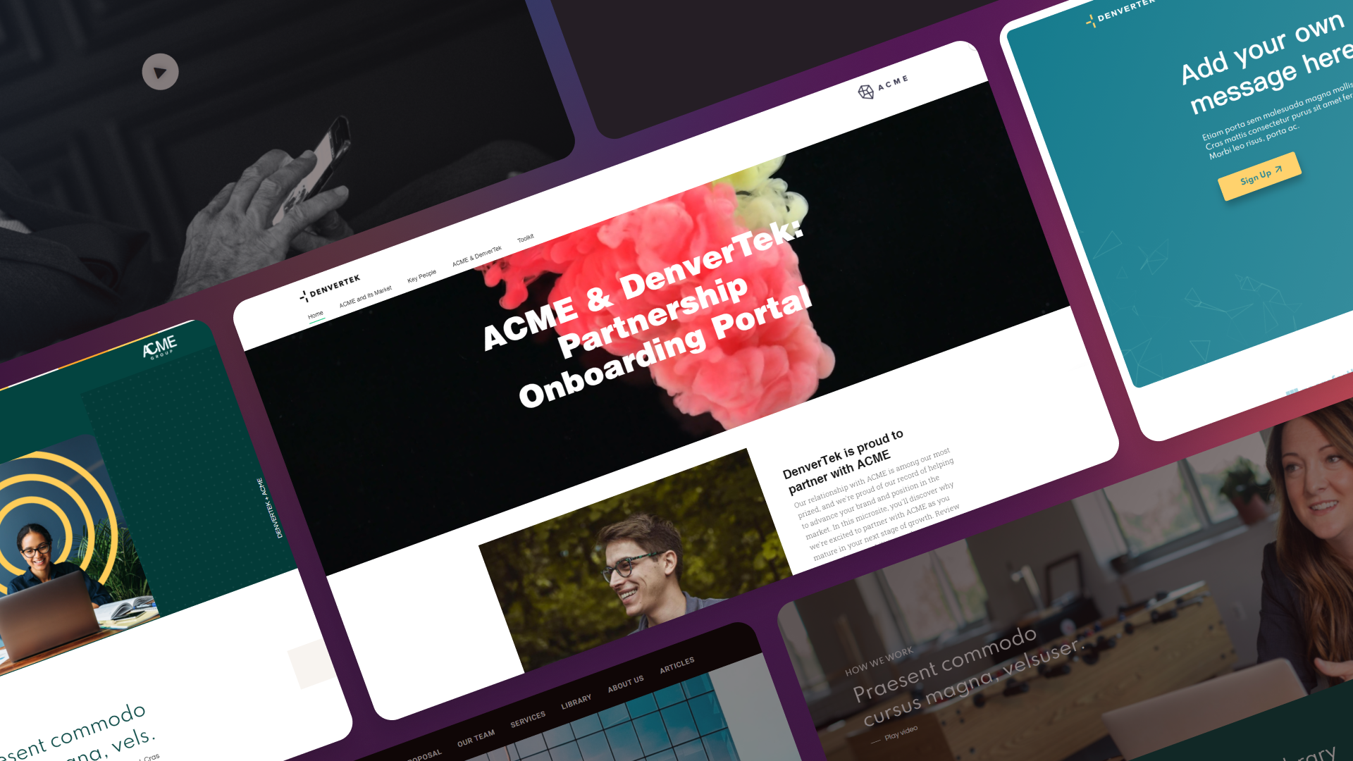
A recruitment microsite closes that gap by giving the role, the program, or the employer brand its own page — one built to inform a decision, not just list requirements.
Ready to go digital?
Discover how Zoomforth can help you.
Join 500+ enterprise sales, marketing and HR teams building trackable microsites — no developer needed.
Rated 4.5/5 on G2 · Trusted by Fortune 500 teams
Thanks — we've got your request.
Our team will follow up shortly. If you'd rather pick a time yourself, grab a slot below.
Where an employer brand actually reaches a candidate
Most employer branding work stops one step short of the candidate. A team runs the research, writes an employee value proposition it believes in, agrees the messaging pillars, and puts the result into a slide deck and a set of brand guidelines. Then the candidate encounters the company through a job posting that none of that ever touched.
That is the gap this guide is about. An employer branding strategy decides what you stand for as a place to work. A microsite is one of the few places that decision becomes something a candidate can actually read, watch, and act on before they apply.
Three properties make the format suit the job:
- It holds more than a listing and less than a careers site. An EVP needs room — day-in-the-life content, real people, what the first ninety days look like. A job posting template has no space for any of it, and rebuilding the careers site to add it is a project rather than a campaign.
- It can be specific to an audience. Employer brand messaging that speaks to graduate applicants and senior engineers at the same time speaks to neither. A microsite per programme or per talent segment lets the same EVP be expressed in the terms that audience recognises.
- It reports back. You can see which sections candidates read and where they stop. That is the closest thing talent teams get to a measurement of whether the EVP is landing, as opposed to whether the leadership team liked it.
The rest of this guide covers how to build one: what stops working first, what candidates decide on, the content blocks, and how to measure it.
Why a job posting and a careers page stop working for competitive roles
A standard careers page is built to hold volume: dozens or hundreds of job listings, each one a short block of requirements and a link to an application form. That structure works when candidates already know they want to work for you and are just looking for an open seat.
It works far less well when you are trying to convince someone to apply in the first place. For a high-priority role in a competitive market, or a graduate program competing for the same early-careers talent as every other employer in your industry, a candidate needs more than a bulleted list of qualifications. They need to see what the job is actually like day to day, what the team culture feels like, and what they get in return.
A plain job posting cannot carry that. It is a fixed template designed for scanning, not persuading. Candidates read it, compare it against three other postings that look nearly identical, and move on to whichever employer gave them a clearer picture of the actual experience.
What candidates actually decide on before they apply
Talent acquisition teams often assume the application form is the moment of decision. In practice, most candidates decide whether they are interested well before they click apply, based on how much they can picture themselves in the role.
A recruitment microsite gives you room to answer the questions a job posting cannot: What does a typical week look like in this role? Who will I work with? What does this company actually value, beyond a mission statement? What happens after I submit my application? Candidates who can answer these questions before applying are more likely to follow through, and more likely to be a genuine fit once they do — which cuts down on the mismatched applications that cost a recruiting team time later in the process.
This matters most for two situations: roles competitive enough that candidates have other offers to weigh yours against, and programs with such high application volume that self-selection before the application step saves the team meaningful screening time.
The content blocks a recruitment microsite is built from
Regardless of whether you are hiring for one role or running an always-on employer brand hub, the same blocks do the work.
- Role or program overview. A clear description of the position or program, written for a candidate deciding whether to apply, not for an internal job requisition. Lead with what the person will actually do.
- Day-in-the-life content. A short narrative, photo set, or video walking through what a typical day or week looks like. This is the content most likely to turn a passive browser into an applicant, because it replaces guesswork with a concrete picture.
- Team and culture video or photos. Real people, not stock photography. A short video with current employees talking about the team carries more weight than any written culture statement.
- Benefits and EVP. Compensation range where you can share it, health and retirement benefits, flexible work policy, and anything specific to your employer value proposition — tuition support, parental leave, career development paths. Be specific; vague claims like “great culture” do not differentiate you from any other listing.
- Clear application call to action. The apply button should be visible without scrolling and repeated at the end of each major section, not buried at the bottom of a long page.
- FAQ about the process. Answers to what candidates actually wonder: how many interview rounds, expected timeline, whether the role is remote or hybrid, and what to expect if they are not selected.
Each block should earn its place based on the hiring situation. A single urgent role needs a tighter, faster page; a graduate program can support a longer, more exploratory one.
Structuring the microsite for different recruiting situations
Not every recruitment microsite should look the same. The right structure depends on what you are hiring for.
A single high-priority role. Keep the page tight and fast to scan. Lead with the role overview and the application CTA above the fold, follow with day-in-the-life content and team culture, and close with an FAQ. A candidate evaluating one specific opening wants to confirm fit quickly, not browse.
A graduate or early-careers program. These pages can carry more content because the audience is exploring, not just confirming. Include program structure (rotations, mentorship, timeline), a broader look at company culture, alumni or current-participant stories, and a clear explanation of the application and assessment process. Because volume is high, a strong FAQ section here also reduces repetitive questions to your recruiting inbox.
An always-on employer brand hub. This structure supports multiple open roles rather than one, so it needs a way to surface current openings without turning into a plain job board. Keep the culture, benefits, and EVP content as the stable core of the page, and treat the list of open roles as a section that updates as positions open and close. This format works well for companies that recruit continuously rather than in single campaigns.
Across all three, the application step itself deserves attention. A long, multi-page application form buried at the end of a compelling microsite undoes the work the content did — keep the first step short, and be transparent about how many steps remain.
Measuring whether your recruitment microsite is converting candidates
Two metrics tell you more about a recruitment microsite than a single conversion number.
Application completion rate. Track how many candidates start an application against how many finish it. A large gap between visits and started applications points to a problem with the content or the CTA; a gap between started and completed applications points to friction in the form itself, often too many fields or too many steps up front.
Time-on-page by section. If your microsite platform supports section-level analytics, look at which blocks candidates actually spend time on. A day-in-the-life video that holds attention while a benefits list gets skipped tells you where to invest more content next time, and which sections are safe to trim. This kind of data is difficult to get from a plain job posting, since there is no way to see which part of a bulleted list a candidate actually read.
Reviewing both metrics after each hiring campaign, rather than only at the end of the year, lets a talent team refine the microsite structure while the role or program is still open, rather than waiting for the next cycle to make changes.
Building a microsite for agencies versus in-house teams
Everything above applies whether you are an in-house talent acquisition team hiring for your own roles or a staffing and recruitment agency building candidate experiences on behalf of clients. The content blocks and structure are the same; what differs is scale and branding. An agency typically needs to spin up a new page per client or per role quickly, often under the client’s own branding rather than its own. For that use case specifically, see how recruitment agencies use Zoomforth to build and manage candidate microsites at volume.
For more on how microsite structure shifts across other use cases, see these microsite examples. And because a recruitment microsite that ranks well keeps attracting candidates organically between campaigns, it is worth applying the fundamentals in this microsite SEO guide before you publish.
Ready to build a recruitment microsite that attracts and converts more candidates? Request a demo.
Frequently asked questions
What is a recruitment microsite?
A recruitment microsite is a dedicated, branded page built to attract and convert candidates for a specific role, a graduate or early-careers program, or an always-on employer brand hub. Unlike a generic careers page, it combines role or program details with culture content, benefits, and a clear application path in one focused destination.
How is a recruitment microsite different from a job posting?
A job posting lists requirements and duties in plain text on a job board or careers page. A recruitment microsite adds the context a candidate needs to decide whether to apply: day-in-the-life content, team photos or video, benefits and EVP messaging, and answers to common process questions, all built around a clear application call to action.
What content should a recruitment microsite include?
A complete recruitment microsite includes a role or program overview, day-in-the-life content, team or culture video or photos, a clear breakdown of benefits and employer value proposition, a prominent application call to action, and an FAQ section covering the interview and hiring process.
How do you measure whether a recruitment microsite is working?
Track application completion rate to see how many candidates who start an application finish it, and use time-on-page by section to see which content candidates actually spend time on, such as day-in-the-life video versus a benefits list. Both metrics point to specific content or form changes rather than a single vague conversion number.
What is an employer branding microsite?
An employer branding microsite is a standalone branded page that presents your employee value proposition to a specific talent audience — a graduate programme, an engineering function, a location — with the culture content, benefits, and application path in one place. It differs from a careers page in scope: a careers page lists every open role for everyone, while an employer branding microsite makes the case for working at your company to one audience, and is measured on whether that audience applies.
How does a microsite fit into an employer branding strategy?
The strategy defines the EVP and the messaging; the microsite is one of the channels that carries it to candidates. In practice it is the channel where you have the most control — unlike a job board listing constrained by a template, or a review site you do not own. Most talent teams build one always-on employer brand hub plus a microsite per priority programme or campaign, all drawing on the same EVP so the message stays consistent as it reaches different audiences.