
When people think about really great landing pages, they’re almost always thinking about B2C. That’s probably because 1) the average person isn’t bumping into B2B landing pages all that often, and 2) they can be a little trickier to master.
After all, the best B2B landing pages not only have to nail their sales pitch to get that all-important conversion rate, but they have to do so while talking to experts instead of the general public. Oh, and they also need to look good doing it – no easy task!
To get you inspired to create your own killer B2B landing pages or microsite, we’ve rounded up 8 of the best B2B landing page examples available. Let’s dive right in and get that inspiration flowing.
Ready to go digital?
Discover how Zoomforth can help you.
Join 500+ enterprise sales, marketing and HR teams building trackable microsites — no developer needed.
Rated 4.5/5 on G2 · Trusted by Fortune 500 teams
Thanks — we've got your request.
Our team will follow up shortly. If you'd rather pick a time yourself, grab a slot below.
The 8 best B2B lead generation landing page examples
Datadog landing page: short and snappy copy
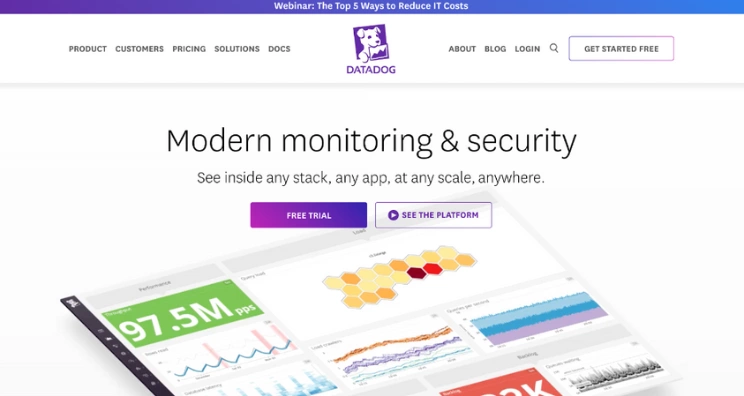
Who are they? Datadog is a security and monitoring platform for cloud-based services.
What are they doing right? The reason Datadog’s landing page makes our list of the best B2B landing pages is that it uses short, snappy copy to offer relevant information in an instant. The current headline, “AI-powered observability and security,” sits above a trust bar of customer logos, so visitors immediately see who else relies on the platform before they’re asked to do anything else.
That helps users that know what they want to get straight to the point. Two clear CTAs — “Free trial” and “See the platform” — keep the next step simple, and further down the page, event promotions and analyst reports serve as additional reasons to believe (RTBs).
Miro landing page: clear visuals of their UI
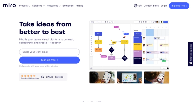
Who are they? Miro is a free virtual whiteboard that allows team members to brainstorm and collaborate from anywhere.
What are they doing right? This has to be one of the best sales landing pages of recent years especially within the software niche. The reason is the way that Miro has gone about using its strengths. Since Miro calls itself a visual platform, it’s important that they show as well as tell on their landing page. The headline now leans into AI-agent positioning — “The collaboration layer your AI tools are missing” — paired with a keynote video visitors can watch instead of a static UI screenshot.
It also gives visitors space to sign up immediately, with a “Get started free” CTA alongside “Contact sales.” Instead of just a client-logo strip, Miro now backs up its scale with concrete numbers — 250,000+ companies and 100 million-plus people — plus a customer quote, which speaks to its trustworthiness as well as its popularity.
Thinkific landing page: target audience-based strategy
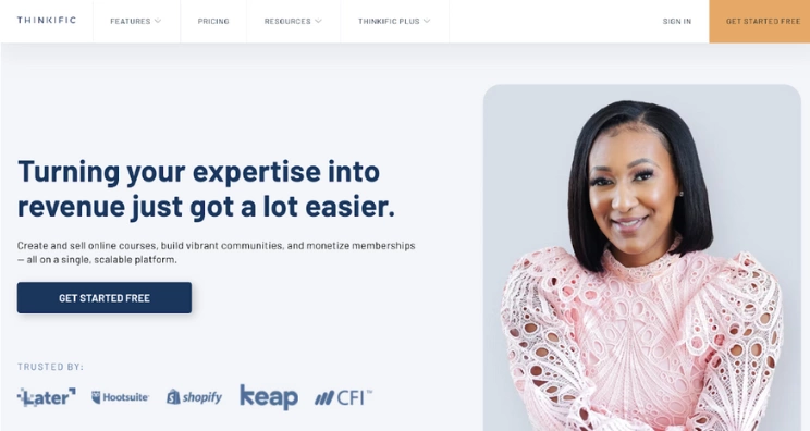
Who are they? Thinkific is an all-in-one tool for those that want to share their expertise by building their online courses and learning communities
What are they doing right? This Thinkific landing page example is great because it uses the human element to make an impact. Thinkific’s business model is centered on individuals, so it makes a lot of sense to put a face to their proposal. The page now features a different real customer front and center under the headline “Powering the world’s top learning businesses,” which still shouts, “This could be you!”
The landing page goes on to break down key value props — course creation, community and membership, and payments — in a short, easily scannable section that does a great job highlighting how much Thinkific can do. Finally, ending the page with even more real-life proof can help push indecisive visitors over the edge into converting.
Toast landing page: videos and demo
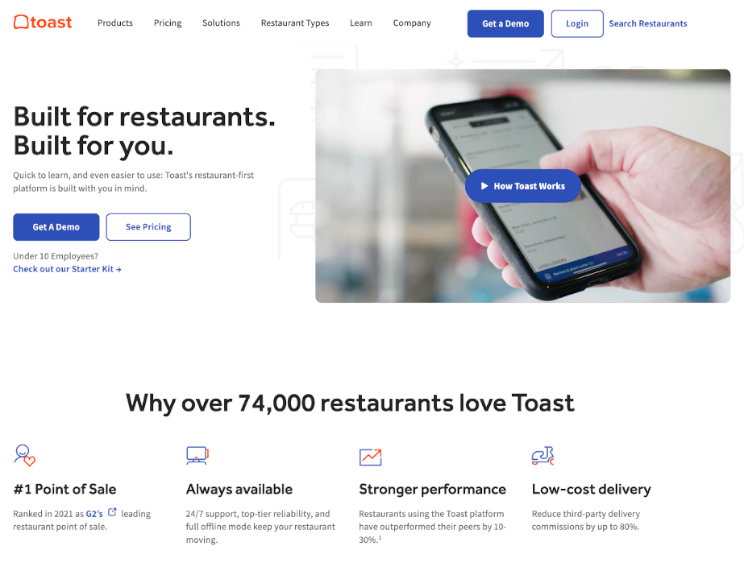
Who are they? Toast is a point of sale (POS), payroll management, marketer, and more for restaurants and restaurateurs.
What are they doing right? Toast leads with a bold customer-count stat — over 156,000 restaurants trust the platform — rather than relying on a single hero visual to make its case. Like so many of our favorite lead page examples, it still saves room for links to the demo and pricing info right at the top.
Because Toast has so many offerings and can serve restaurants of widely varying sizes, it needs to organize its info in a way that isn’t overwhelming. This landing page does a great job at breaking all their important information down into digestible nuggets. Those nuggets are also clearly labeled, making it easy for visitors’ eyes to jump to the content most relatable to them.
Slack landing page: a clean and super-simple presentation
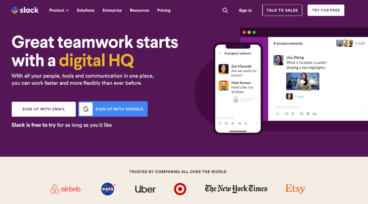
Who are they? Slack is a messaging platform for businesses and working groups that also allows for easy file-sharing.
What are they doing right? While looking at the best landing page examples for lead generation in the B2B world, you’ll often find patterns and elements that are taken as landing page best practices. However, within the category of SaaS landing page examples, Slack changes things up a little. The messaging app now leads with an AI-agent pitch — “All your people and AI agents working together” — and uses clickable interactive tabs (Ask Slackbot, plan launches, run projects) instead of a static UI screenshot. This still gives visitors a clear, clean view of what using Slack is like, with fewer distractions so they can focus more on the product’s features and benefits.
This landing page also finds a way to make great use of a punchy stat, citing that users can save an average of 97 minutes a week with AI in Slack. That helps boost Slack’s credibility with a concrete, specific number rather than a vague claim.
AllWomen landing page: colorful and interactive

Who are they? AllWomen is an online repository of data science, web development, UX/UI design, and product management courses created by women, for women.
What are they doing right? This has to be one of the best B2B landing pages if you’re looking at comprehensiveness and synergy between different web elements. We love the way AllWomen’s landing page plays with color, movement, and modern design without losing sight of its messaging. They smartly encourage you to browse courses and highlight a current, time-limited offer, all above the fold.
But below it is where things start to get playful! They use unique moving icons to draw the eye and illustrate their key points in a super clever way. The page continues to feature a bright and cheery color palette and all of this combines to serve one of AllWomen’s core tenets: to be an open and appealing place for all women. This is a company that knows brand colors are one of the smartest ways to communicate your brand’s overall feel.
DocuSign landing page: carefully placed statistics and CTAs
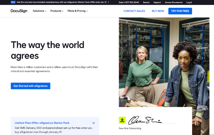
Who are they? DocuSign is a secure digital way to share and sign important documents.
What are they doing right? DocuSign now opens with an AI-powered agreement management pitch, backed by a third-party statistic from a Deloitte report on AI’s effect on revenue growth. Further down the page, DocuSign still shows the scale of its business — now more than 1.8 million customers and a billion users — as supporting proof rather than the opening hook.
What makes their page really stand out is how well thought out and prominent their links are. Every section has a clear CTA as well as an extra link or two to help answer additional questions. This means a lack of info is less likely to stop the visitor from moving forward and the longer they stay on the site, the more likely they are to convert.
HubSpot landing page: info-dense and incredibly scannable at the same time
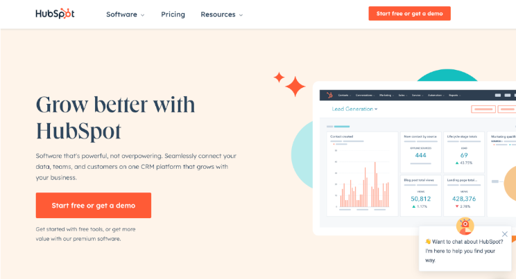
Who are they? HubSpot is a CRM platform designed to help businesses connect their teams, data, and customer service.
What are they doing right? HubSpot goes for an ultra-clean design that relies only on its main brand color (orange) to unify the page, now under the banner of its “agentic customer platform” positioning. Sticking with the clean design, they create a page that’s both info-dense and incredibly scannable using lots of bullets and subheads to direct the visitor to the info they need.
Instead of a single dominant CTA, the hero now presents two clear next steps side by side — “Get a demo” and “Get started free” — with the demo option listed first. Visitors only interested in scanning only need to read a single subhead before they know which button to click, which helps get them to where they want to go quickly and effectively.
Great B2B landing pages are easy to create with Zoomforth!
Now that you’ve seen these awesome B2B landing page examples and your brain is overflowing with inspiration, you’re hopefully ready to get started on your very own killer landing page with Zoomforth!
Zoomforth does more than help you build a simple landing page — it helps you build sleek microsites. What’s the difference?
While landing pages and microsites serve a similar purpose, a microsite gives you more flexibility in your design, allowing for multiple pages and other functional features. With Zoomforth’s simple drag-and-drop tools, you’ll have your page up and running in no time. Request a demo today!
Photo by Brands&People on Unsplash
Frequently asked questions
What makes a great B2B landing page?
The best B2B landing pages share five qualities: a headline that matches the visitor's search intent or ad copy exactly, a value proposition that speaks to a specific pain point rather than a generic benefit, social proof from credible B2B companies (named logos, specific statistics, or a short quote), a single clear CTA above the fold, and fast load time. B2B landing pages that convert well treat the buyer's time as scarce and eliminate every unnecessary element.
How are B2B landing pages different from B2C landing pages?
B2B landing pages serve buyers with longer decision cycles, higher stakes, and multiple stakeholders. They typically need to convey more technical proof, provide credibility signals (client logos, security certifications, analyst recognition), and offer a lower-commitment first step (a demo request or content download rather than an immediate purchase). The emotional trigger in B2B is risk reduction — buyers want to feel confident the vendor is trustworthy and the solution is proven.
What B2B landing page elements drive the most conversions?
The highest-converting B2B landing page elements are: a headline that names the specific outcome (not just the product), a brief subheadline explaining how the outcome is achieved, two to three named client logos or a specific success metric for social proof, a form with the minimum necessary fields (fewer fields = higher conversion), and a CTA button that describes the next step clearly ('Request a demo' outperforms 'Submit'). Remove navigation links — they are conversion leaks.