Looking to drive app downloads and increase your online presence? The right web content can put your app in front of hundreds of potential users’ faces. However, you don’t have to create a whole website just to drive traffic to your app. Instead, you should use a landing page!
Designing a landing page for your app starts with finding the right template. Here are some app landing page templates we love!
5 elements of a good app landing page template
A mobile app landing page is a one-stop spot of hyper-specific information. It targets specific users who are looking for more information about what your app has to offer and how it can be used.
They are powerful tools you can use to boost conversion rates and capture leads. Your app landing page design should include these key elements:
An attention-grabbing headline for app landing pages
One of the very first things a user will see on your app’s landing page is the headline. In most cases, it’s pretty hard to miss!
While it may be easy to overlook, your header is important. It’s the introduction to the content you will be sharing and can help readers (and search engines) figure out if your content is relevant. Being careful about the headers you use is important for getting your app’s foot in the door in preliminary searches and for getting the user’s attention.
This does come with a caveat, though. Writing attention-grabbing headlines for the sake of, well, just getting attention won’t cut it. That strategy will lead you to more clicks, but it won’t mean much because the bounce rate will be high. Instead, opt for using some of these techniques when building your landing page headlines:
- Be concise and specific! You should be able to capture your audience by addressing their needs or pain points head-on in an easy-to-read headline.
- Incorporate a call to action to narrow your engagement funnel and create a clear headline that motivates your target audience
- Emphasize or reflect your value propositions or brand ethics in your headlines. Be sure to be consistent in tone, style, and voice!
- Keep things short—less than ten words is the goal!
- Don’t be afraid to directly address your target audience—the content is for them, after all!
Informative, engaging copy on the mobile app landing page
Because a landing page is narrow in scope, you have room to tailor your written content so that it’s information-rich and descriptive. This makes it possible for you to create content that’s geared exclusively toward action and drives engagement.
Your copy should be information-rich without being overwhelming. It boils down to a balance between being concise without cutting corners where it matters most. You can achieve this by playing with formatting options and design, too.
Especially because most web pages have less than 10 seconds to make an impression on visitors, making information as consumable as possible is key. Embracing bullet notes, breaking content up into short sections with skimmable headlines, and using plain language can help you achieve this.
Focus on highlighting user features and tools that differentiate your app from others. This is a little bit like creating the ultimate intro on a dating app. Sell yourself! Be exciting, bold, and quick to the point. With so many fish in the sea, it’s important to stand out.
A clear, compelling CTA for app landing pages
Driving action is all about clear calls to action (CTAs).
A CTA is essentially an action that you offer users to take while they are browsing through content or making decisions. There are many reasons they are important, especially when it comes to designing the ultimate app landing page.
CTAs are direct elements of your landing page that stand out from other elements, usually because they are attached to buttons or highlighted hyperlinks. These redirect attention to the bottom of your sales funnel, converting interest into action.
They serve as the tiny but mighty axis your conversion rates turn on. They can be used to promote app downloads, capture leads, and so much more. When they are well-crafted, they can be used to drive essentially any action you want!
CTA best practices follow a similar suit to those for headlines:
- Prioritize concise, direct language. The more specific your CTA is, the more effective it will be.
- Don’t forget to include a verb! After all, it is the “A” in CTA.
- Place them strategically in your content so that they follow especially compelling pieces of information that peak users’ interest.
- Be sparring! Too many CTAs can lend the appearance of spammy content that is pushy more than it’s compelling.
A relevant, appealing image for app landing page design
Images are powerful tools that can be used to emphasize your branding, elicit emotions in your landing page visitors, and can even help get information across in a way that is concise and consumable.
Selecting the right images for your landing page is an easy way to elevate your visitor’s experience and break up content. It makes everything more consumable and more memorable! Recent studies have revealed that when information was paired with an image, it was memorable for 65% of participants. Without images, only 10% retained shared information.
Images play an important role in user engagement and are an easy way for you to increase the amount of time visitors spend on your landing page.
As with anything, careful consideration goes a long way here. Too many irrelevant images can be distracting, especially if they are inconsistent with branding or content.
Use photo editors and web tools to make images play into the selected color schemes you are working with. For example, if your app’s branding is based on a neutral-toned palette, it wouldn’t make any sense to incorporate highly saturated neon imagery in your landing pages.
You can also determine where images should be placed so that they are the most interesting and effective. They can serve as the background of your landing page, appear wrapped in the body of your copy, or show up alongside other content. Whichever way you choose to incorporate imagery, be sure it enhances your landing page, rather than bogging it down with extraneous design elements.
A lead form that captures visitor info
While it may be true that not all of your site visits will lead to a download, there are other valuable actions to target from your audience!
Landing pages are also extremely valuable lead-capture tools. When your site visitors share contact information with you, whether or not they’ve downloaded your app, they offer you an alternative opportunity to refocus your engagement efforts.
Not only this but capturing this sort of information is an easy way for you to collect and generate user data. Website and lead capture data clues you in on who your content is reaching and who is most likely to engage with what you’re putting out.
This makes it easy for you to refocus or tailor branding efforts so that your landing page lands exactly where you want it to.
Coupling website analytics with lead capture opportunities, like email forms or demo opportunities, means the content that’s shared can focus on the features they may have missed, offer app reviews, or incorporate use cases that your users may find compelling!
5 app landing page inspiration templates to elevate your design
Yes, yes, we agree. Looks should not matter, at least in most cases. For your app landing page, though? Aesthetics are everything. Here are five well-designed app landing page templates that you can use to start increasing app downloads. Be sure to pick one that matches your app’s branding and industry area!
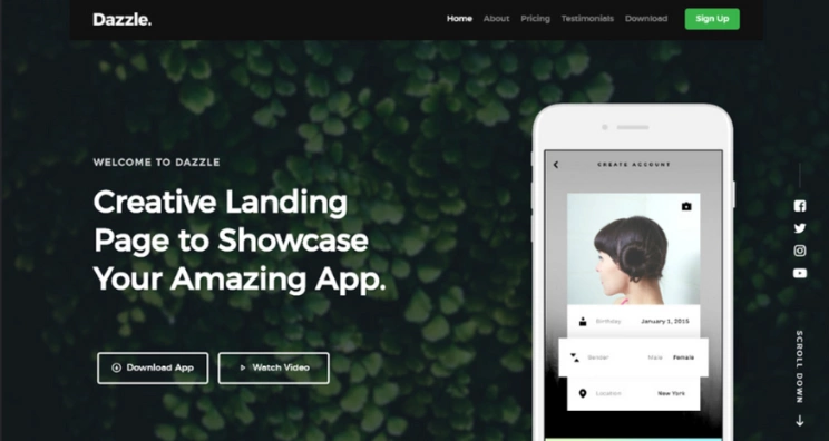
The clean and modern landing page
This template is the perfect balance between comfort and professionalism. It’s clean and modern, featuring crisp lines, and bold but neutral colors, and opts for minimal graphics. The text is clean, and the layout is a simple, easy-to-navigate traditional scroll-through landing page.
Friendly and inviting mobile app landing page design
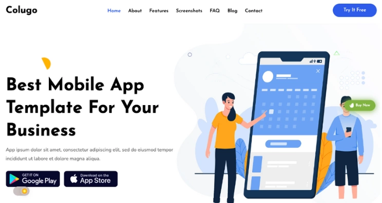
Want your app to feel a little bit like it could be a user’s new best friend? Opt for something friendly and fun! We love that this template uses playful graphics to add whimsy to a tech experience. Not only that, but the design is highly practical and has so many options for developers to incorporate subpages. Plus, there’s a clear free-floating CTA button, and a direct link to both Google Play and the App Store!
Bold and concise application landing page
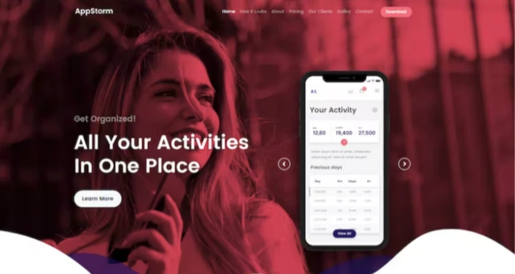
Contrast is a powerful design strategy to play with. It can help you create a landing page that is sexy and sleek without sacrificing the opportunity to highlight important app features. This layout showcases in-app features with a scrollable graphic of different screens you might see in the app, allowing graphics to do the work that text copy might have otherwise done. We love how clean this template is, and that it still includes plenty of CTAs.
Playful and bubbly app landing page template
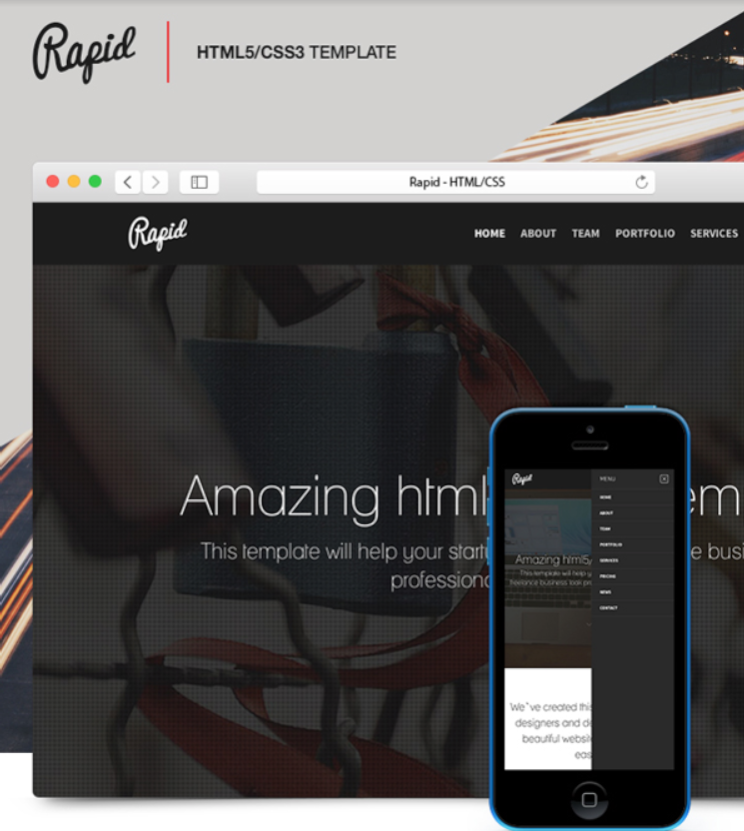
Looking for something fun and playful? We love that this template incorporates curly, bubbly font types. There are multiple color schemes to choose from, so you can elevate a lighthearted feel with soft colors.
Getting down to business mobile app landing page
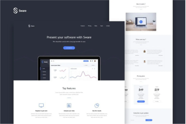
Keep your landing page simple and straight to the point. This no-nonsense template skips the frills and instead works with a minimalist pallet, the perfect design for a totally feature-focused landing page.
Need more than a landing page for apps? Try a microsite!
Mobile app landing pages are great tools for getting information across and driving CTAs; however, they may not be the right way to create an immersive content experience for your target audience.
Microsites, on the other hand, are robust web tools that make it easy to target niche audiences, deliver information-rich content, and expand your online presence. They are the fully trackable, secure alternative for mobile app landing page. Here at Zoomforth, we specialize in creating and hosting microsites.
We also have our own gallery of inspiration samples that you can base your microsite design on. Using landing pages may have cut it before, but it’s time to make yourself stand out from the crowd with a microsite.
Try out a free demo of Zoomforth today!
Photo by Brett Jordan on Unsplash
