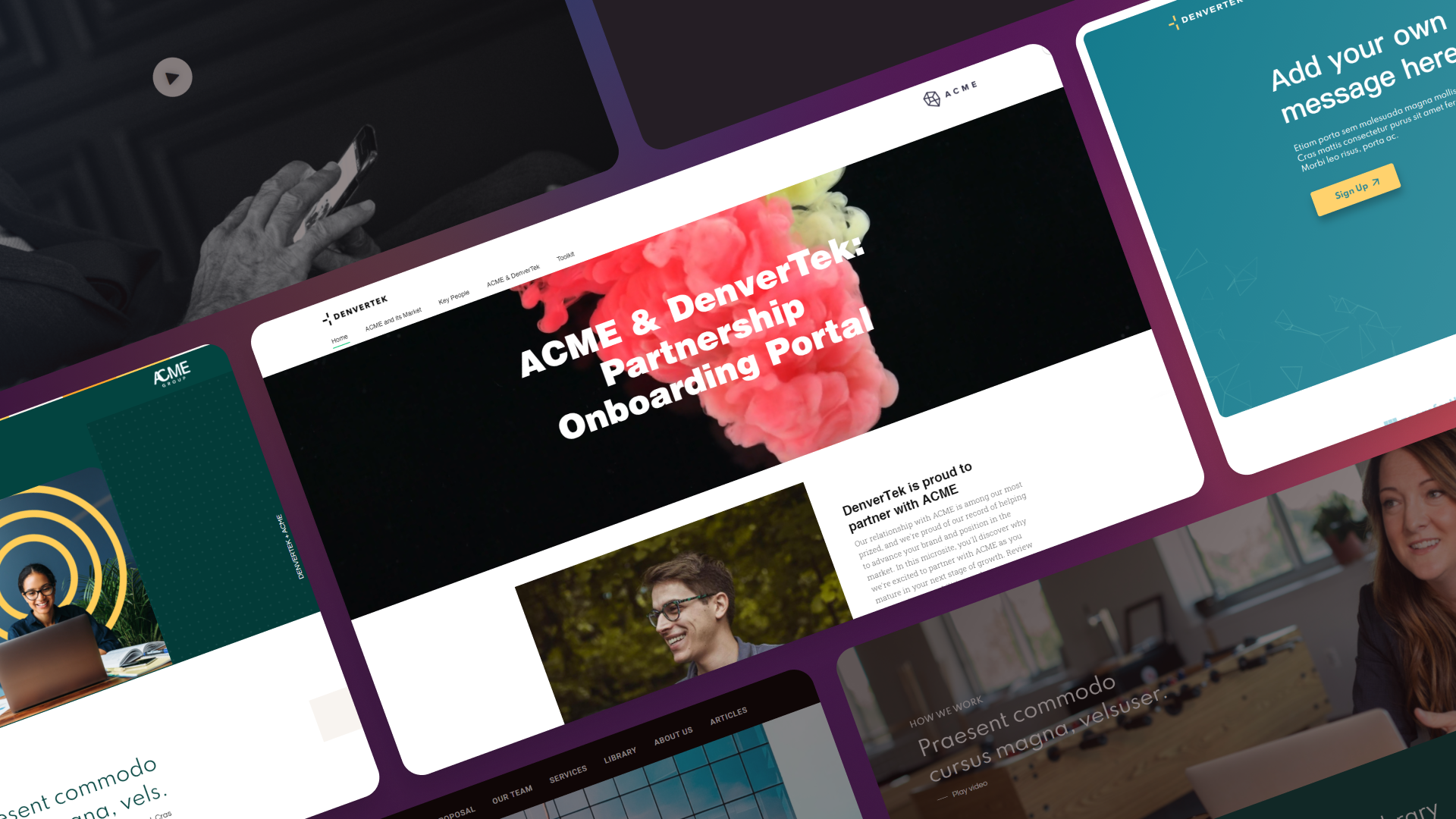
Borders are one of the most versatile tools in microsite design. Used well, they create visual structure, guide the reader’s eye, and add a polished finish to your pages. Used poorly, they create visual noise and clutter.
This guide covers how to use border styles effectively in your microsite designs — from subtle separators to creative framing techniques.
Ready to go digital?
Discover how Zoomforth can help you.
Join 500+ enterprise sales, marketing and HR teams building trackable microsites — no developer needed.
Rated 4.76/5 on G2 · Trusted by Fortune 500 teams
Thanks — we've got your request.
We'll be in touch by email to set up your demo.
While you wait, browse real microsites in our microsite inspiration gallery or learn the basics in the Zoomforth Academy.
Why borders matter in microsite design
Borders serve several important functions in a microsite layout:
- Define sections. Borders can separate content areas, making it clear where one section ends and another begins.
- Highlight elements. A border around a call-to-action box or testimonial draws attention without relying on background color alone.
- Create visual hierarchy. Thicker or colored borders signal importance. Subtle borders indicate secondary content.
- Add polish. Consistent use of border-radius on buttons, cards, and images gives a microsite a modern, finished look.
Types of border styles for microsites
Most microsite builders support these border styles:
| Style | Best use case |
|---|---|
| Solid | Cards, buttons, section dividers, image frames |
| Dashed | Callout boxes, draft indicators, temporary content |
| Dotted | Subtle dividers, secondary separators |
| Double | Accent borders on headers or featured elements |
| None | Clean layouts where spacing does the separation |
For professional microsites, solid borders with subtle colors are the most common and safest choice. Save dashed and dotted styles for specific cases where you want to signal that something is different.
Creative uses of borders in microsite layouts
Card frames
Use a light solid border around content cards to define each card’s boundaries. A 1px border in a neutral gray (#e5e7eb) creates clean separation without adding visual weight. Combine with a small border-radius (8px) for a modern card look.
Image borders
A thin border around images helps them stand out when placed on a white or light background. Use a color slightly darker than the background — not pure black unless the image is very light.
Section dividers
Instead of full borders around sections, use a top or bottom border to create subtle dividers between content areas. This is especially effective on long-scrolling microsites where sections need visual separation.
Accent borders
Use a colored left border on callout boxes or testimonial sections. This creates visual interest without needing full border styling. A 4px left border in your brand accent color instantly signals that this content is special.
Border radius: softening the edges
Border-radius is one of the easiest ways to make a microsite feel modern and approachable. Here’s how to use it effectively:
- Buttons: 4-8px border-radius. Enough to soften the edges, not so much that they look pill-shaped.
- Cards: 8-12px border-radius. Creates a clean card look that works well on both desktop and mobile.
- Images: 8-16px border-radius. Softens image edges, especially useful for screenshots and team photos.
- Circular elements: 50 percent border-radius. Use for profile photos, logo avatars, and icon containers.
Keep your border-radius values consistent. If cards use 8px, all cards should use 8px. Inconsistent border-radius makes a design feel sloppy.
Accessibility considerations for borders
Borders affect how users interact with your microsite. Keep these guidelines in mind:
- Focus indicators. Interactive elements need a visible focus border for keyboard navigation. In Zoomforth, all interactive elements include a focus border by default for accessibility compliance.
- Color contrast. Border colors need sufficient contrast against both the element background and the page background. A light gray border on a white background may be invisible to some users.
- Don’t rely on borders alone. If you use borders to indicate interactive elements (like clickable cards), also use other visual cues like hover effects or cursor changes.
How to add borders in Zoomforth
In Zoomforth, you can control border styles at multiple levels:
- Theme level. Set default border styles for buttons, cards, and sections in the theme editor. This ensures consistency across all pages.
- Element level. Use the visual editor to add or adjust borders on individual elements — images, text tiles, button blocks.
- CSS classes. For advanced border styling, create custom CSS classes and apply them visually. This gives you full control over border width, style, color, and radius for any element.
Ready to build a professional microsite with polished border styling? Request a demo.
Frequently asked questions
What border styles can I use in a microsite?
You can use solid, dashed, dotted, double, and rounded borders. The most common choice for microsites is a solid border with a subtle color and small border-radius for modern, polished look. Dashed or dotted borders can work for callout boxes or to draw attention to specific content without overwhelming the design.
How do I add borders to elements in my microsite?
In most microsite builders, you can add borders through the visual editor by selecting an element and setting border width, color, and style. For more control, you can use CSS classes. In Zoomforth, you can apply border styles through the theme editor or by adding custom CSS classes that you apply visually to any element.
What is border-radius and how should I use it?
Border-radius rounds the corners of an element. Small border-radius values (4-8px) create subtle rounding that softens the look of cards and buttons. Medium values (12-16px) work well for images and profile photos. Large values (50 percent) create circular shapes. For professional microsites, use small to medium border-radius consistently across similar elements.
When should I avoid using borders in microsite design?
Avoid borders when they add visual noise without serving a purpose. If your design already uses background colors, shadows, or spacing to separate elements, borders may be unnecessary. Also avoid thick, high-contrast borders that compete with your content for attention. Borders should support your design, not dominate it.