If you’re presenting online, then you might have considered whether putting together presentations or microsites represents the better approach for your business.
Each methodology has its own advantages and disadvantages. But understanding them is vital to knowing when it’s best to send over, say, an interactive sales presentation, and when an interactive format such as a microsites might be a more appropriate solution.
However, the key here is to know how to make presentations more interactive for sales without making mistakes that will reduce your chances of closing the deal. After all, making a presentation interactive is more than just tacking on all the bells and whistles possible. It is not only knowing the myriad ways to make presentations interactive but also knowing the right time and place to use them. Let’s go through some practical dos and don’ts of how to make presentations more interactive, especially when focusing on sales.
Linear vs. non-linear: understand reader journeys before creating interactive presentations
One of the fundamental differences between microsites and sales presentations is that between linear and non-linear reading experiences. Static documents — like Word files and presentations — present information linearly. Even when these resources have embedded hyperlinks, by habit, readers tend to read them from beginning to end, like a story or a book.
Compare this to the typical manner in which web browsers interact with online content. Users are accustomed to every online web page having a header or sidebar filled with links to other content. Jumping around on the internet is the norm. Statistics bear out just how true this is. Your average internet user reads only about 20% of the information on a web page and their average attention span has dropped to just 8 seconds (from 12 seconds in 2000).
While it may seem advantageous to use linear resources for sales online presentations, the opposite is often in fact the case.
Consider a resource such as a website being shown to a prospective client while a call is in progress. Halfway through the call, the prospect — who is an executive in a financial capacity — asks whether your company is compliant with a key financial data governance standard. There’s good news — your marketing team has a page on the website outlining the data certifications the company has achieved. And better news — you’ve added that page to the header navigation and your reader can easily pick it out while the demo is going on. Directing recipients’ attentions to different URLs while jointly reviewing a text document would be far more cumbersome and greatly increase the chance that things like misspellings and miscommunication could muddy the message.
Therefore, whether to use linear resources or non-linear ones really depends upon the type of information being presented and your readers’ typical browsing habits:
- Legal documents, such as terms and conditions statements, typically do not require the reader to jump to text links. Rather, they are parsed linearly. Additionally, for that reason, recipients often print them out and have their legal teams inspect hard copies. Because of the above, it is often better to create these resources in the traditional manner — as PDFs or Word documents. These are designed to support linear reading.
- Sales presentations over Zoom, on the other hand, often involve drawing the reader’s attention to several different aspects of the selling team’s offering — not all of which can comfortably be fit within the confines of one text document. This is where you can make online presentations using a microsite for a more engaging experience.
- In other instances, it’s best to mix and match. There’s no reason why the legal page of a microsite, for instance, couldn’t simply contain an embedded text file with a download button for legal recipients to quickly download the file.
To determine which is a better fit for what you’re trying to communicate, consider asking yourself the following questions:
- Is my recipient likely going to read this on their computer or will they print it out?
- If we’re going to be reviewing this document in tandem during a pitch call, is everything I will need to draw their attention to already in the document or should I preempt that they will have questions about other parts of my service offering?
Some best design practices to create an interactive presentation
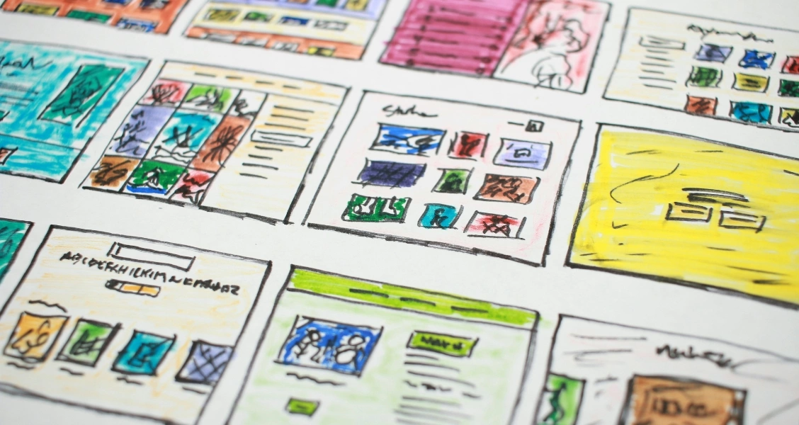
Some guidelines will help sales teams develop pixel-perfect microsites which will both impress their recipients and achieve their communication objectives in the best way possible.
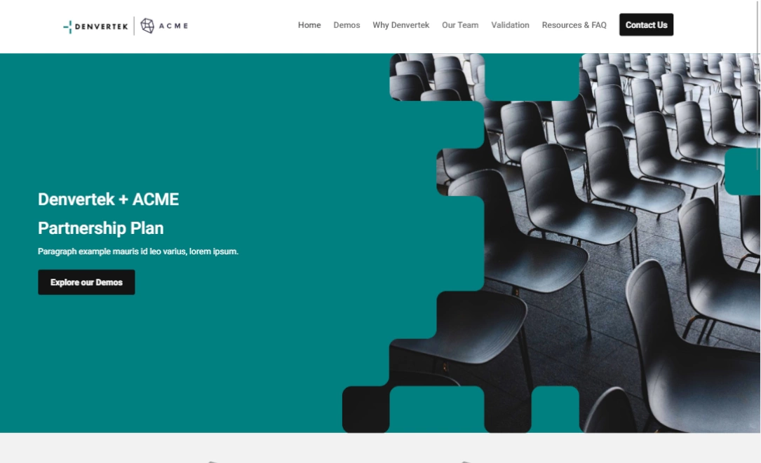
Interactive presentations with a deck-like structure
At Zoomforth, we’re seeing many users develop microsites in a deck-like format, with a page dedicated to each service offering. They’ll present the information linearly from header to footer whilst on a conference call. If the client has a question on a related service, they can seamlessly navigate to a different page, for that specific content.
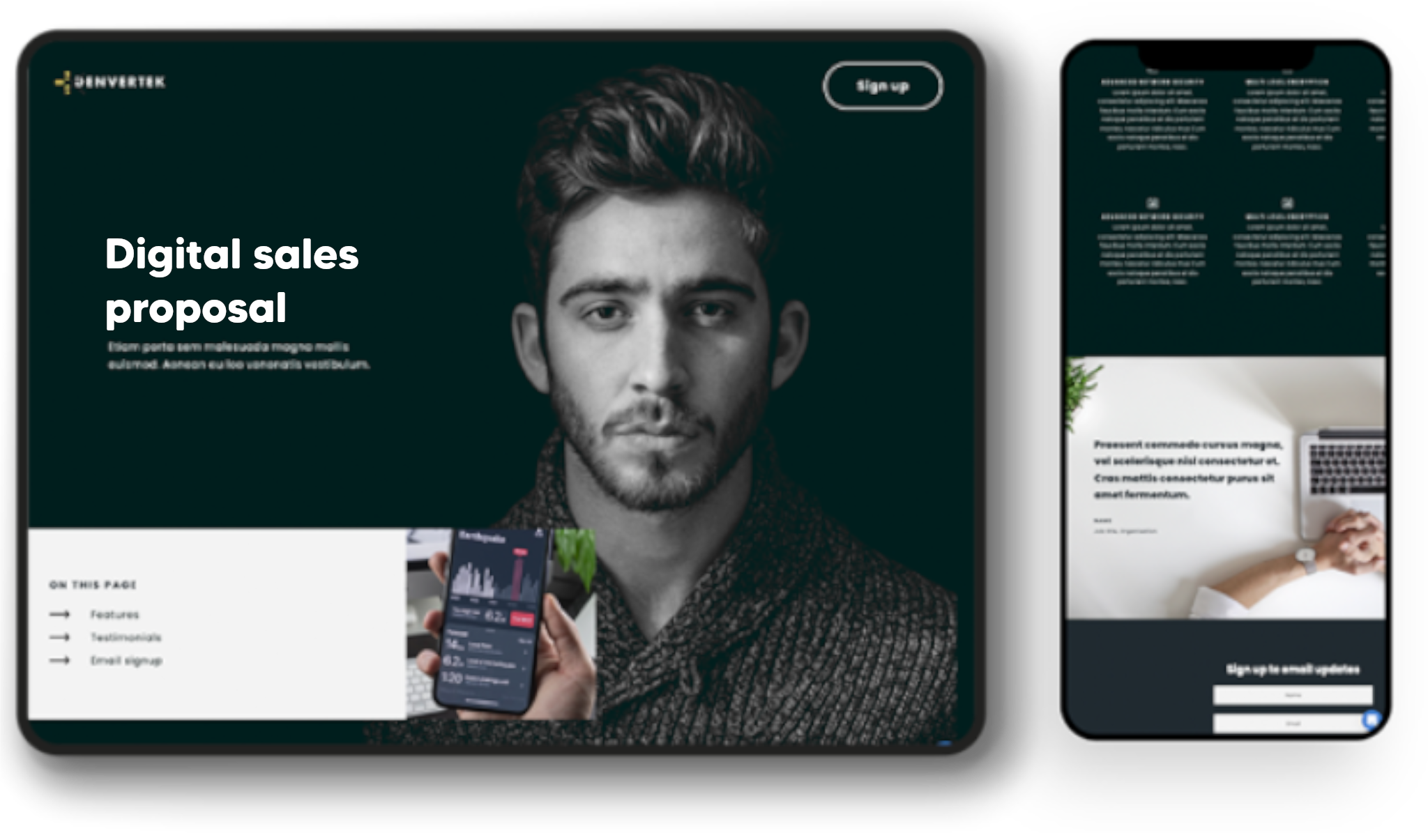
We commonly recommend that primary site navigation should contain no more than 7 topics. If design teams have a lot of content to cram into a single microsite, they should consider adding additional pages into sub-navigations. Alternatively, in-page navigation panels can be used to include additional site content without cluttering up the main site.
A sample header navigation for an RFP response could include links to:
- Home
- Proposal
- Team
- Pricing
- Credentials
- Case Studies
- Resources
Microsite designers could consider hiding or revealing content as the sales development process progresses. For instance, pages can be created in advance and only later made visible to the user in the site navigation.
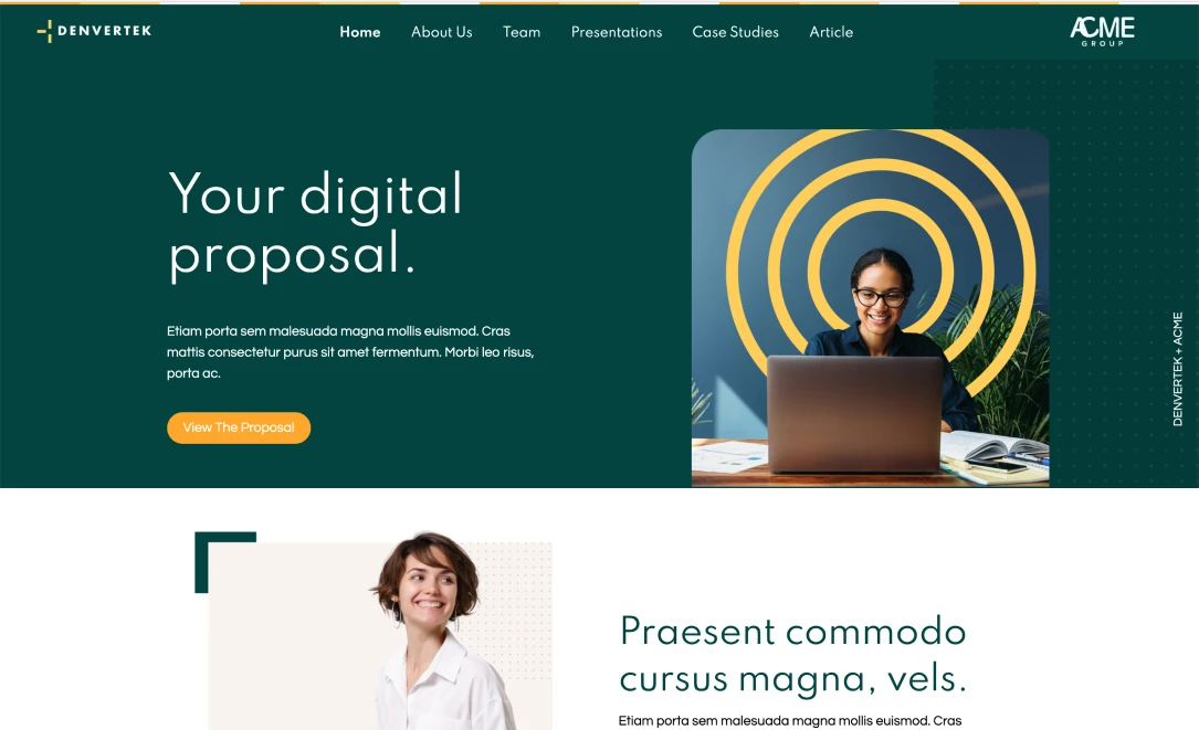
Making presentations interactive with appropriate content and typography
Each page on the microsite should have clear content.
Additionally, users should stick to their brand font and color palette. Unless users have graphic design and branding experience, it’s best to stick to just one font. Sans serif fonts look more modern and work well for online media. Arial and Old Sans are both popular choices. Just make sure to steer clear of Comic Sans at all costs (unless you want your bid proposal to be perceived as humorous!)
It’s also a good idea to keep each page of the microsite relatively brief. You don’t want readers to get lost in a wall of text while you are trying to draw their attention through a microsite page on a call. Bear in mind that people scan text while viewing websites — they don’t read linearly!
Making presentations interactive with the right visuals
Video is great to liven up a text page but videos, when used in microsites, should be short and sweet. We commonly recommend 60 to 90 seconds as a good target length. If they’re any longer than that, readers’ attention tends to get drawn away.
Consider also adding photography and other visuals that you know will resonate with your buying audience. Make sure to keep these appropriate, though. If they don’t add value, there’s no need to include them. We often see users trying to ‘glam up’ a page with unnecessary visuals that often just distract. Avoid stock imagery too if possible — real photos are preferable and do a better job at conveying authenticity.
Charts, graphics, and infographics are all great resources that can be used to convey complex points easier than by using words.
Including calls to action (CTAs) to make your presentation more interactive
It’s a good idea to record the online sales pitch and then upload it to the microsite where those who couldn’t attend the call live can conveniently access it. It’s also a good idea to include a call to action (CTA) with the recording link. After they have listened to the call, what action do you want them to take, specifically?
Make sure to include clear contact information and set up notifications so that you know when the audience has visited your site.
Interactive presentation platforms have room for static resources too!
Both microsites and static resources can be deployed effectively during remote sales engagements. In fact, static content can be interspersed throughout microsites. Knowing when to use which depends on whether the audience is going to read your text in a linear or non-linear fashion. Pay careful attention to design aspects, include appropriate CTAs, and make good use of visuals to create the most effective and compelling buyer experiences. And of course, you want the best interactive presentation software on your side too.
Create interactive, trackable and secure sales proposals with Zoomforth.