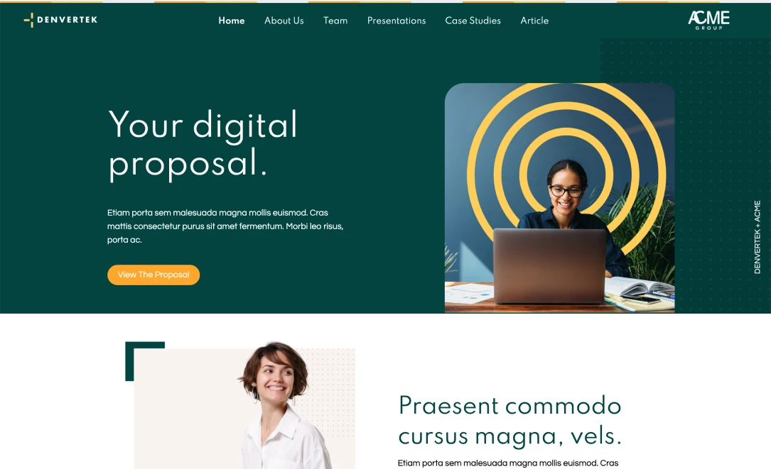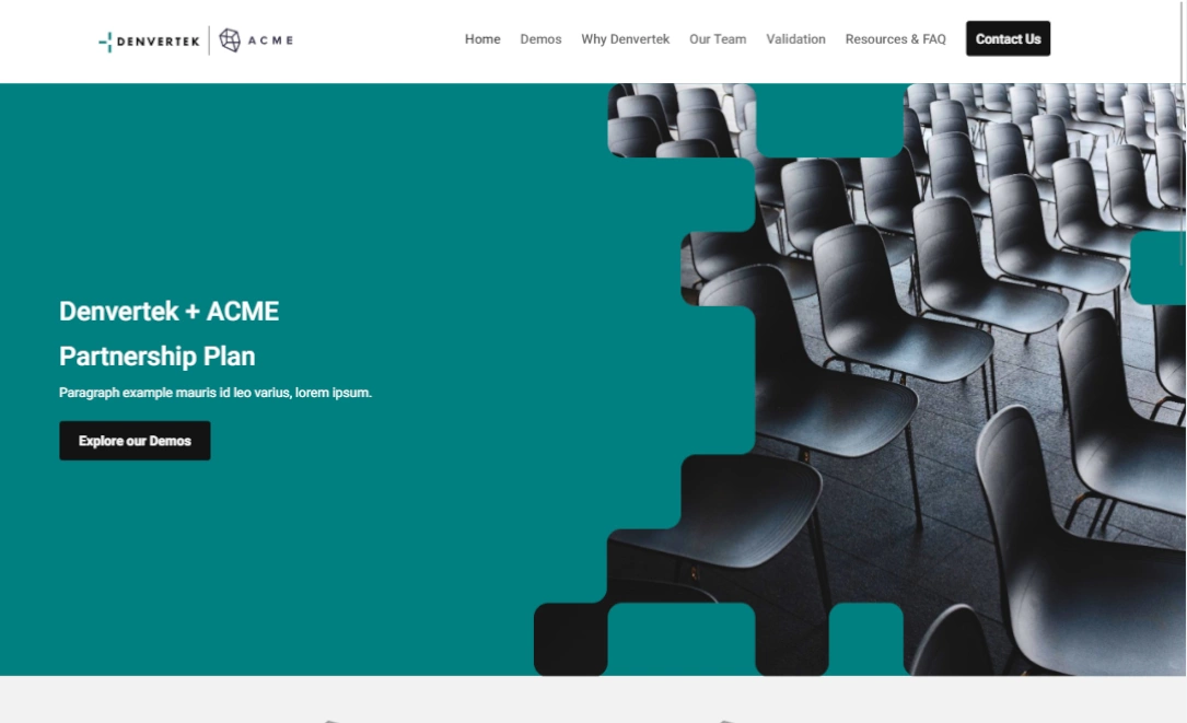
Calls to action (or CTAs) direct the reader to take some action as a result of landing on your microsite.
They are usually just a few works like “Request a Demo”, “Watch this Video” or “Start Free Trial” and they can make an enormous difference in how visitors engage with your content. Well-written and thoughtful CTAs are essential to snapping readers out of the text and making the big ask for whatever it is that you’re hoping they do next.
Calls to action are essential signposts that help prevent your site visitor from leaving the site too early. Those might be:
- Prompting them to download a static resource containing a snapshot of all the information spread out over other pages
- Inviting them to open an interactive map to get directions to your meeting
- Offering a quick video containing a welcome message or executive summary
- Making it easy to request a callback
Here are our top recommendations for using CTAs appropriately within the context of microsites:
Make Your CTAs clear and unambiguous
The first point of guidance about creating CTAs is that they should be clear and leave no room for doubt about what the suggested action for the recipient is.
Again, think of CTAs as signposts. According to Benchmark One, truly compelling CTAs should typically be no more than 7 words in length. You’ll want to keep the font size that you’ve used in your microsite in mind. It’s possible that you’ll want to go with something that’s actually shorter than that if you’re using bigger point sizes.
Some suggested CTAs for sales microsites:
- Download brochure
- Get an instant quote
- Download proposal
Feel free to be a little imaginative. Remember that all aspects of your site branding that we’ve highlighted here should blend together. If your brand voice is a little lighthearted, then that should be reflected in your CTA selection also.
Use a clear and consistent visual language
Typically CTAs are encapsulated within buttons or links.
When thinking about how you want to communicate your brand, make sure to consider the effects of the colors you choose too.
Brand logo and color palette are basic elements of every branding guide. It should go without saying that your CTA buttons should use colors chosen from this selection.
Also pay attention to consistency. If all CTAs are yellow boxes, then don’t put an orange triangle on the next page. That will look “off” and consistency communicates professionalism and organization.
Keep the funnel in mind
Many of our clients use microsites as an imaginative way to take dull worn-out Powerpoint content and rejuvenate it. They create business proposals that convey information about their product or service in a much more imaginative fashion than can be achieved with just a slide deck.
However, whenever designing collateral for use by sales teams it’s important to keep the funnel in mind. Audiences should be kept moving through material that’s bringing them continuously closer to actually making a decision or a purchase.
For example, when you present your team’s capabilities on your ‘Qualifications’ page, you could place a CTA that links off to the page where you present the actual quote for business.
Some suggestions for how you could word this:
- “How much?”
- “Our quote”
- “Brass tacks please
Just make sure that your CTA is in keeping with the brand voice and the level of formality that you think your audience is going to be expecting.
Test and gather data to make smarter decisions
Marketers these days are all about leveraging data to achieve better results.
Therefore, it might be worth convening some focus groups to solicit feedback on how “dummy” users are reacting to the CTAs that you’ve chosen to include in your site.
Alternatively, you can set up an A/B testing solution by sending two versions of microsites to different groups of recipients.
According to CXL, which specializes in customer experience (CX) optimization, making simple tweaks leveraging A/B testing can boost conversion rates by 15%. All for a couple of edits!
If you’re going to be creating a Zoomforth template that you can iterate from for many proposals, then it’s definitely worth going to the trouble of cooking up something really good that you can use to build many proposal sites from in the future.
Build your experiments. Leverage the data that comes in. And build something that really works to win your company business.
Microsite CTA creation at a glance
Make sure that your microsites stand the best chance at achieving their purpose by judiciously adding a few very impactful calls to action where appropriate.
Make sure that:
- All the CTAs you include are as brief and concise as possible. This isn’t the time for nuance. You want to prevent churn by giving your readers clear direction about where you want them to go next.
- Always keeping the funnel in mind and build CTAs that suggest a logical sequence
- You leverage data in order to refine your CTAs for greater impact.
To learn how Zoomforth can help you increase your microsite impact, register for a place on one of our skills sessions here.