These days, with so much online pitching going online, it’s extra important to put effort into ensuring that content experiences are crafted as effectively and expertly as possible.
At Zoomforth, we’ve helped countless selling teams and organizations to build better online microsites to communicate with target audiences ranging from buying committees to potential job candidates.
Here are some of the best practices we have developed from that experience.
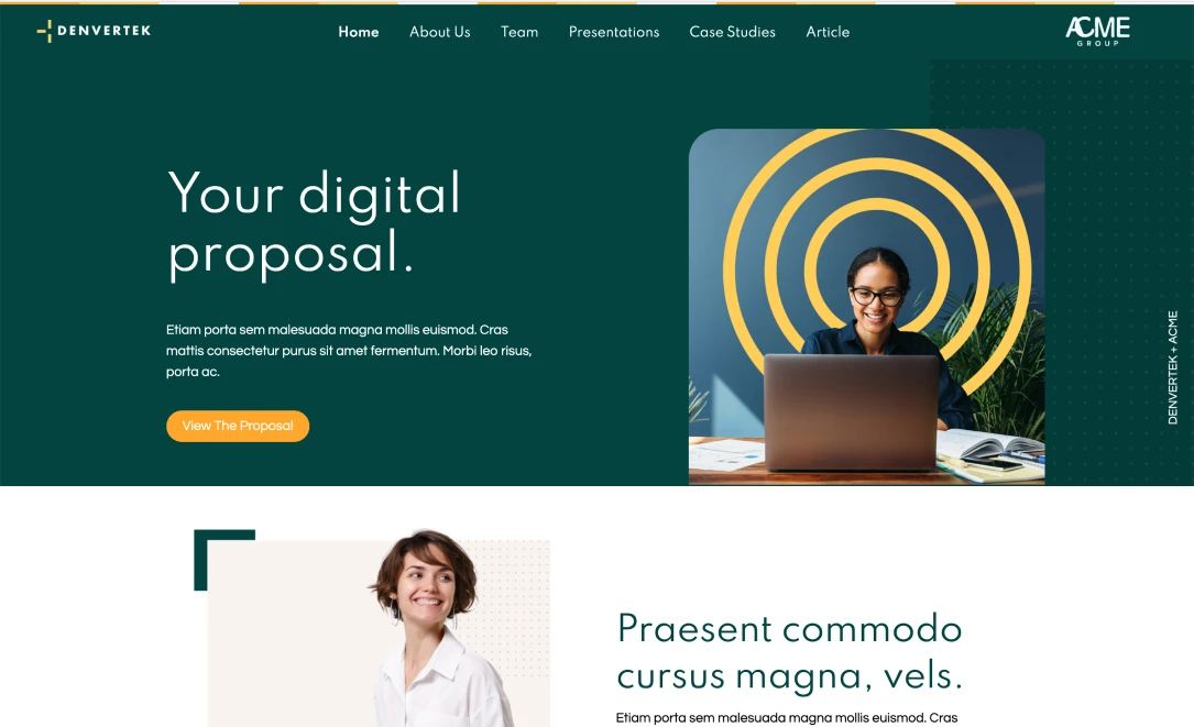
Make your hierarchy easily visible
 Left: cluttered navigation. Right: just right!
When writing for SEO, authors are commonly advised to develop their text from an outline and then order sections into H1, H2, and H3 tags according to their priority in the flow of the text. It’s not only search engines that like pages of text that are well organized into a fixed hierarchy.
When developing microsites, it’s advisable to make sure that your pages adhere to a very clear visual hierarchy. Readers tend to scan online text rather than read it linearly. Those designing online content experiences must bear in mind that readers are likely to jump to the sections that interest them and skip over the rest of the text entirely. The key to doing that? Section headings.
Use your space wisely
Developing sites according to a column layout is a great way to pack a lot of information into a short amount of pixel space — saving the recipient from having to scroll through reams of text. Nevertheless, attempting to cram too much information, or leaving empty patches, are both likely to leave an undesirable impression on the reader. Here are some ways to avoid that:
- Don’t leave too much white space: While it’s important to space out your content in order to avoid making the website look too cluttered and overwhelming, equally it’s a good idea to ensure that there aren’t any obvious gaping reams of white space on your page. If you don’t have any content to fill up a multi-column layout with, then consider just reverting to a single column layout.
- Don’t make the design too visually ‘busy’: Sometimes, designers will attempt to use a bewildering variety of different font sizes and colors in order to differentiate between different thoughts in the same paragraph. Invariably, this just makes the website appear disorganized and overwhelming to those reading it. Avoid the temptation to fill up sites with too many tiles and font styles. This only leads to visual clutter. That makes it much harder for readers to engage with your message. End result: less impactful communication.
 Left: too much whitespace. Right: just right
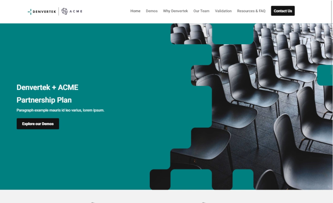
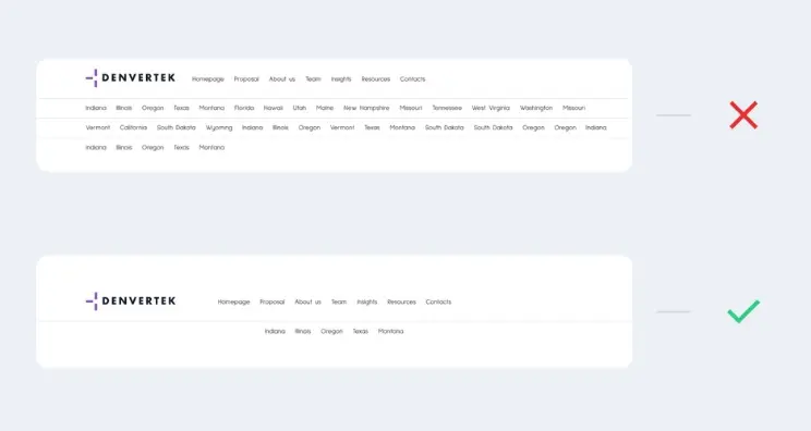
Pay attention to your navigation bar
If you’re developing a content experience for a group of people, like a buying team, then the site navigation matters a lot more than you might think. The finance representative on the receiving team is likely interested mostly in the financials. The recruitment or HR representative wants to know about the company background. If you’re using a website as a modern upgrade on a pitch deck, then make sure that it’s easy for recipients to jump to the parts of the site that interest them.
If you don’t include a clear navigation, and spread relevant links throughout the appropriate anchor text, you risk negating a lot of the benefits that microsites have to offer over text documents or presentations. Some specific tips to make your content experience more navigable include:
- Ensure that your menu only extends to one line wherever possible. If your menu breaks into two lines then again this tends to look overly busy and is distracting.
- Remember that many recipients are going to be viewing your microsite on a mobile device. How does your site look on that? If you’re not sure, then you can use Developer Tools as a simulator.
Use the same font throughout!
Professional brands pour extensive resources into standardizing their brand. This extends to layout elements such as font types, font points, and colors. Our recommendation: borrow a page from the professionals and do the same.
Even if you don’t want to invest the time in creating formal branding guidelines and a style guide, you can still take some basic steps. These include:
- Keeping font variability to a minimum. Your H1, H2, H3, and paragraph text should all use the same font. The sizes of each of these standard headings should also be uniform.
- Make sure that you don’t have text overruns in key sections of your website. This might require playing around with the font to keep paragraphs to a consistent layout.
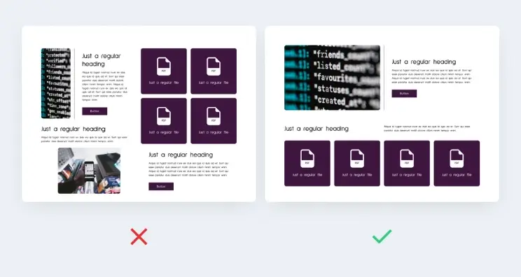
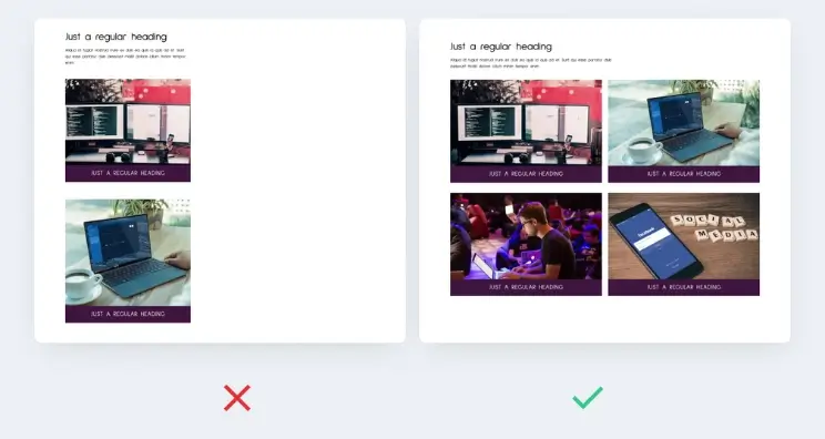
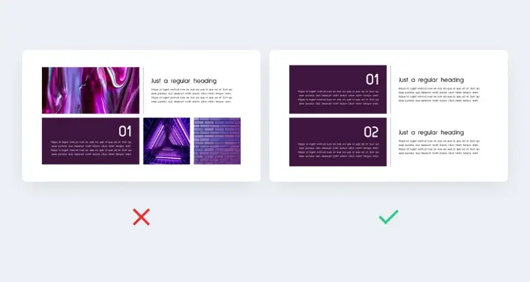
Purposeless images are… purposeless
A picture speaks a thousand words. But a stock image that has absolutely no relevance to your microsite might speak … none at all.
 Left: a non value-adding image. Right: better!
We’re all constantly being encouraged to be more visual. However, at the same time it’s important that everything you include in your content experience adds value to the reader. These days, with so many meetings and introductions happening remotely, it’s important to strive for authenticity. Stock imagery can achieve the opposite effect — sending a message to a client that your communication is a cookie-cutter formula that uses elements that you didn’t develop yourself.
Review your content experiences. If you have images that don’t add any value, you can simply replace them with text. Keep the pictures for those visuals that will really drive home a message about why your company is the obvious choice for the job/project/hire.
Make sure to also:
- Avoid low resolution imagery. Use the following table to convert between tile size and pixels and make sure that your image resolution exceeds the guidelines for both height and width.
- Crop photos to full width or tile. Poorly cropped photos look amateurish. Make sure to crop your photos to the full width of the tile. Account for the caption height when cropping faces.
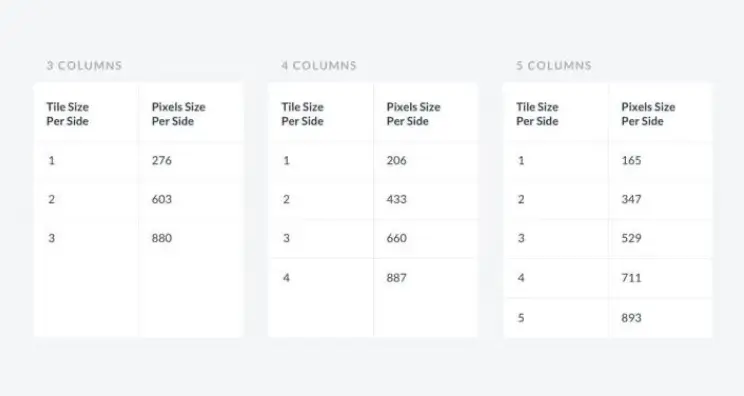 Column pixel reference. Download it here.
Other tips and tricks
You should also:
- Be selective about what content you include above the fold (the level where the page loads and before users scroll). Although there are those who advocate including absolutely all important content above the folder, this can lead to visual clutter. Strive to include your best content there. But not at the expense of creating distracting visual clutter.
- Use a variety of widths and heights on your tiles in order to vary up the appearance of the page and make it look less formulaic for visitors.
- Use the grid in order to indent text. This allows text to be laid out side by side. Design tips for page layout microsites.
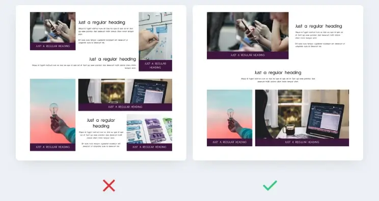 Left: stuffed above the fold content. Right: just right.
Create beautiful microsites
Follow the above guidelines to create beautiful looking microsites which will leave static resources like text documents and Powerpoints biting the dust and wondering why nobody wants to open them.
Click here to book a demo or contact us to find out more about the Zoomforth platform.