In the first of our Zoomforth design explainer articles, we spoke to Luke Jones, Zoomforth’s Director of Design, to discuss what images you should include when designing microsites.
Thanks for checking out the first blog in our Zoomforth Design #101 series, we’ll be focusing on some of the best practices from the world of design and looking at how you, as a Zoomforth user, can implement these when building your microsites.
Imagery is one of the most important aspects to consider when building a microsite – whether you intend to use yours as a digital sales proposal, for personalized recruitment, or any other use case (check out some of those here). Unfortunately, slapping a few stock photos into a microsite in a bid to break up the text isn’t likely to be a successful strategy. To achieve the best results, the image selection process has to be as thoughtful as the process that goes into creating the text.
Here are a few quick guidelines to set you in the right direction when you’re picking out imagery for your microsite.
Make sure that your imagery meets your brand guidelines
Many brands produce detailed style guide material that sets down standards for both the design palette (colors, fonts, etc) as well as the brand’s tone of voice and communications.
When deciding what imagery to include in a microsite, it’s vital that the images selected comply with any guidelines that might be in existence. If the brand guidelines haven’t been drafted yet, then extrapolate from the overall communication guidelines and work out what kind of tone is going to be appropriate for the imagery being used.
If you haven’t already developed brand guidelines, then this could be a great chance to do so. While picking out imagery on the fly might seem tempting, ultimately, readers are going to be more impressed when they see a consistent look and feel across your communications that has been clearly coordinated.
The grid is your friend … make use of it
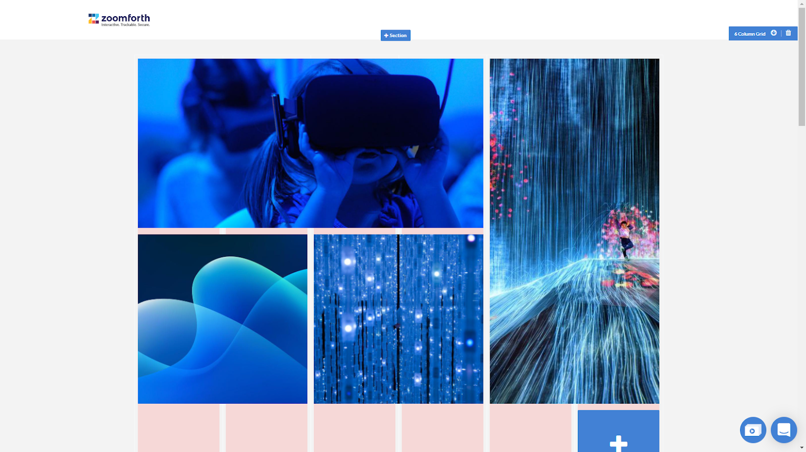
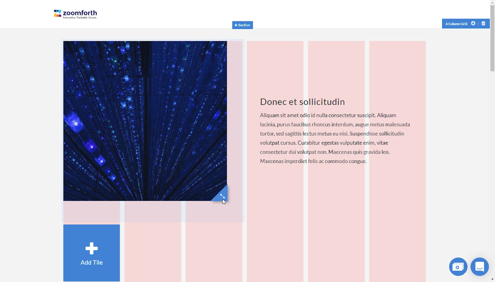
Zoomforth’s user interface includes a 20-column grid system that allows you to create a wide variety of pixel perfect layouts for your images. You can quickly and easily create beautiful image montages or sections that contain multiple elements, like text accompanied by an image. Simply drag and drop your images into your sites, and then you can move them around and change their shapes, as you wish.
If you are not confident in laying out your content, remember that you also have access to a branded Style Guide. Your Style Guide comes complete with a library of branded components that you can copy & paste into your sites. Take a look at some of the options that we have built into our system.
People can up the excitement factor
Your first focus when picking imagery to complement a microsite should be identifying images that will help to explain the message being communicated. It’s also useful to include a mixture of imagery that includes both static objects and people. This holds true whether you’re using microsites for sending a sales proposal, to recruit personnel, or to support your marketing.
Photographs of people can help build empathy and a human connection with site viewers. For instance, an authentic photograph of your key team members, deep in discussion in the boardroom, can help to build trust with recipients.
This doesn’t mean that you need to use human photographs in every image. Simply a mixture of static objects and human imagery is advisable in order to boost engagement levels.
Use stock imagery – but only sparingly
Stock imagery fulfills a vitally important function for organizations involved in producing news and content marketing collateral. It can help to plug the vital gaps that might exist between the imagery that you have on hand —or can get —and the imagery that could best communicate the information contained in your microsite.
Unfortunately, there are a few pitfalls that those using stock imagery need to be aware of. For one, research has proven that being exposed to imagery has the ability to alter people’s moods. You may not think that your stock imagery containing a slightly frowning executive, or a room full of fake smiles, will have any effect upon your microsite’s reception, but these things can have an impact upon how your readership feels when viewing your site on a subconscious level.
Secondly, because many companies maintain subscriptions to popular stock imagery portals, there’s a chance that any photograph that you will use will have been used by many other brands before you—including your competitors. It’s never a good look to be the thousandth company to use a certain well-known image. So it’s worth developing an internal image library to complement the one you may have access to.
Using imagery that you develop “in house” can also be a great way to diversify the type of imagery used on your site. Real photos of your team will add a more authentic look and feel than posed, stock images, every time. Take a cue from the pros and develop your own internal stock image library. You can then be sure that your imagery is unique to your brand, and you won’t need to fork out for subscription charges.
Alt tags make your website more accessible
Some of the people viewing your microsite might be visually impaired. Adding alt tags to your imagery is a best practice that will ensure that the visually impaired are able to access a similar microsite viewing experience to other people accessing the content.
Consider looking up and following other accessibility best practices. For instance, consider verifying that an appropriate contrast ratio is in use between main and offset text in order to make the website visually easier to read. Ensure that any text that is embedded within images is also sharply contrasted and not so small that it can be barely read.
A little image magic can go a long way
In summary, when adding imagery to your sites, here are some quick rules to follow:
- Make sure your images are carefully selected and meet your brand guidelines.
- Experiment with layouts, using our grid system and your Style Guide component library.
- Images can make your sites more engaging and break up long reams of text but don’t overdo it – images should only be used if they add to the story.
- Stock imagery is ok, but use it judiciously. Aim to build up your own, internal stock of images.
- Make imagery more accessible, by using alt tags and paying attention to color contrasts, will help improve your audience experience.

