Odds are, you’re looking for a way to level up your communication strategies or create an immersive content experience. By a stroke of luck (or at the hand of recommendations, case studies, and trending business practices) you’ve come to discover the potential of microsites.
Everything you’ve heard is true! Microsites are the perfect way to create niche, information-rich websites for targeted users. They’re easy to create and deploy with just a little bit of planning and some creativity. Here are some practices you can put into action to start seeing a return on your investment in no time.
Microsite best practices for your next project
Focus your microsite objective
A microsite can be a powerful tool to leverage.
With the right focus, it can help you target certain communication needs and return specific analytics to help you direct future communication strategies. With that in mind, keeping your microsite as concentrated as possible can help you make the most of your next project.
The easiest way to accomplish this is by beginning with a narrowed objective.
Before you get into the weeds of creation, start by asking yourself some guiding questions to help you understand what direction each element should take.
- What is the purpose of this microsite?
- What action should it move my users to?
- What pain point or gap in communication does it seek to address?
- Who is my target user, and what do they want to see?
Once these questions are answered, you can begin to consider what content, interactive elements, and calls to action (CTAs) you want to be the focus of your microsite. This hits a combination of making your microsite more user-friendly and making the most of what your analytics has to offer.
Your objective affects every step down in your microsite design. Therefore, it’s something that should be carefully considered by your team before any other action is taken.
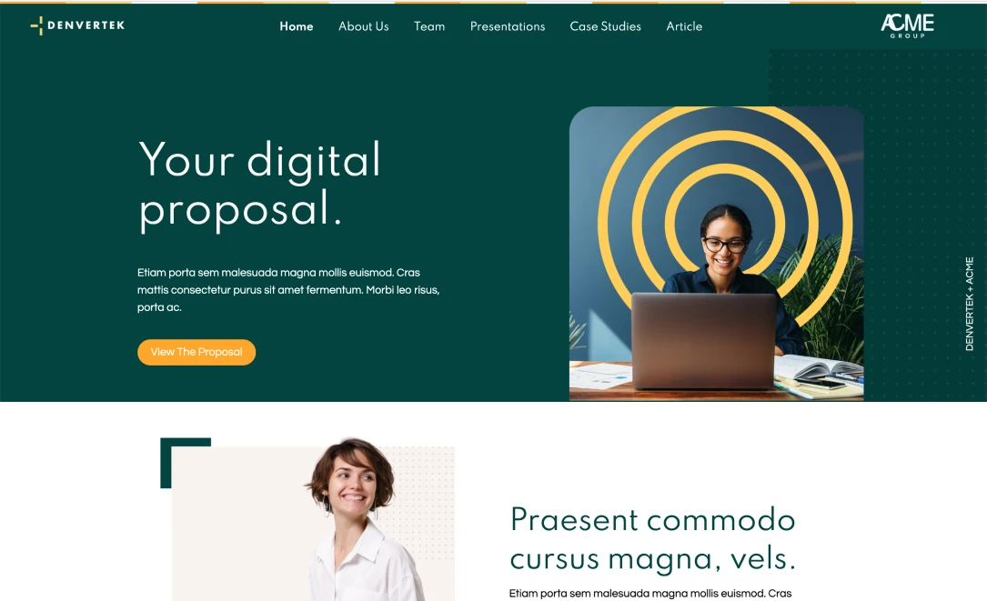
Create a custom digital content experience
Once you’ve decided what you want your microsite to do, you can map out how you want to do it. This is where creating a pool of robust content comes into play.
Content is key here, especially when it comes to creating a memorable and productive user experience. Because your objective is narrowed, your content should be, too. Consider the information that you want your users to walk away with. This should be the focal point of your microsite.
When it comes to crafting microsites with content that packs a punch, less is indeed more. Other information or experiences may stem from the focus of what is being shared, but try to keep things on a need-to-include basis. This focuses user attention where it needs to be, helps you with design, and makes the site more navigation friendly.
With that in mind, microsites also offer flexibility in ways of presenting content, which is a fresh way to keep folks engaged—it certainly beats an email that won’t be read!
Think about how you can make content more digestible for users by using images, graphs, videos, or audio recordings when appropriate. Zoomforth makes it super simple to include these elements with a drag-and-drop facility and media library with unlimited storage.
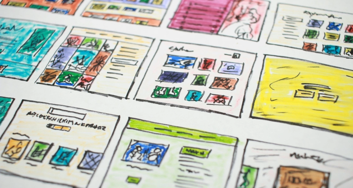
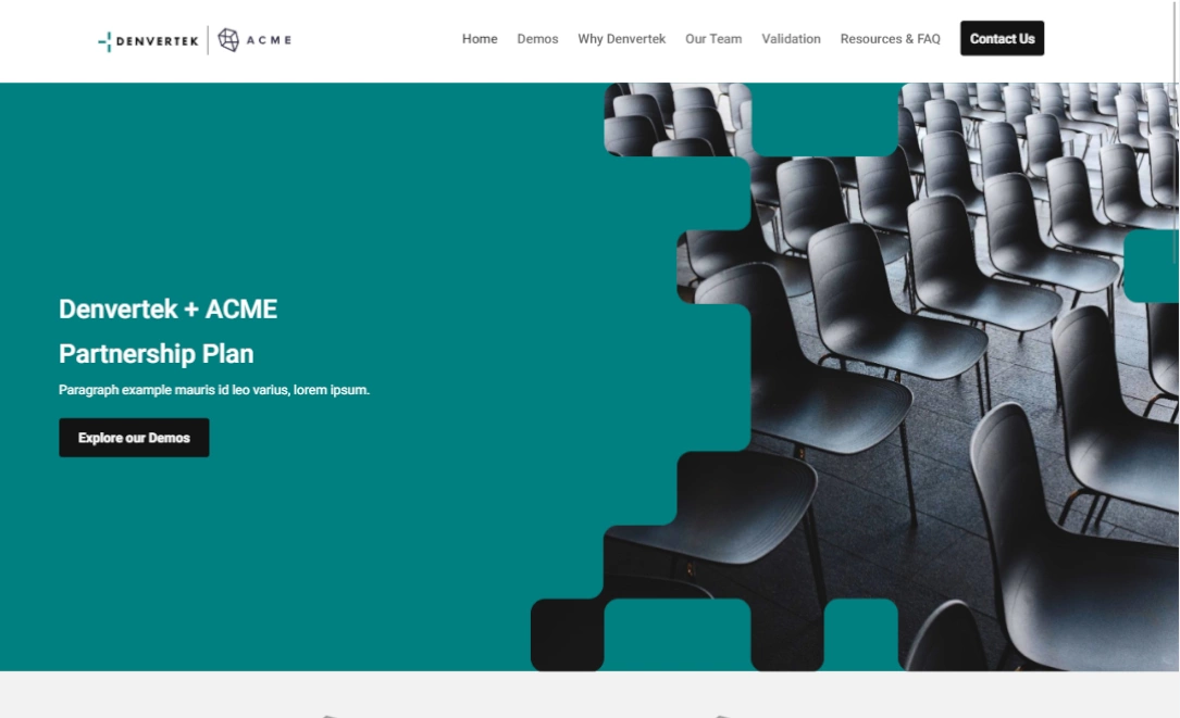
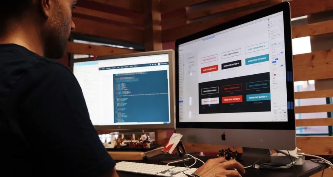
Craft your design around your content
Now that you have the meat and bones of your microsite, it’s time to put it all together. Microsite design is a tad different than general website design. Because they’re hyper-focused and target a rich user experience, your design strategy will revolve around a niche experience.
It should maximize engagement with content while keeping users’ needs in mind. Unlike other webpages, your microsite visitors are seeking out specific information, so your design should revolve around the content they’ll most engage with. Some basic principles will help you design a microsite with content and users in mind.
First, make your design simple. Avoid extraneous elements and overly complicated layouts. This can be distracting to users or make sites more difficult to navigate. This means making use of white space and readable fonts.
Second, make your design clear. Use intuitive layouts and easy-to-see navigation tools to help direct users from one part of your site to another. This also means making use of reading patterns to make content easier to read.
Third, make your design consistent. Use design elements or principles that users are familiar with. This means things like keeping your subpages on the left or top of the screen, positioning your search bar in the top right corner, and putting contact information at the bottom of the page.
Last, make your design structured. Use a clear hierarchy of information as you design your microsite, making what is most important immediately visible and arranging the remaining information from there.
Designing your microsite doesn’t have to be an arduous, technical process. If you’re worried about how to get started, here’s some inspiration.
Appeal to visitors through the senses
You know the old saying “don’t judge a book by its cover?” That might apply when you’re scrolling through a dating app, but it doesn’t apply here.
Microsites should be useful, but also aesthetically pleasing. Plus, unlike other delivery methods, you don’t have to sacrifice style in favor of utility. A beautifully designed microsite enhances user experiences and impacts their behavior!
Research proves what we probably already know: aesthetics can have a significant impact on our preferences. We naturally correlate good design with high-value products.
There are a couple of ways that you can capitalize on aesthetics to create the perfect microsite. Use color, space, multimedia (audio and visual), size, and font to help you create a captivating content experience.
Some pillars to focus on as you piece together different aesthetic elements include:
- Ensuring elements on your microsite belong together and harmonize
- Using space intentionally to cut the clutter and break information up
- Balancing elements together to create symmetry
- Emphasizing content by juxtaposing its style against other visual elements
Ensure universal accessibility
A microsite is only useful if it’s accessible. Accessibility is vital for web design because:
- One in four adults in the United States has a disability.
- Nearly 5% of the population has a serious vision impairment.
- 10% of the population has a cognitive disability.
- The deaf or hard of hearing community makes up 6% of our population.
It’s incredibly important that microsites are designed with everyone in mind. Being mindful about how users of all abilities can access information isn’t just equitable: it’s ultimately good business practice. Losing out on segments of a valuable market can be easily avoided by practicing universal design.
Use legible fonts with adjustable sizing and boldface. Use alt tags with images for visually impaired users using screen readers. Also, use descriptive anchors and button text so screen readers can lead users to your CTAs. Be mindful of color use; the most common colorblindness is red/green, so avoid layering elements of those colors on top of each other. Transcribe videos and create options to engage with content by watching, reading, or listening.
Breakdown those data analytics
Make the most of what analytics have to offer by understanding your user’s experience in depth.
You should have a set of analytics that represent your key performance indicators (KPIs). When analytics are geared towards microsite elements that target specific goals, you can fine-tune your approach. Granular level data analytics on a focused microsite pinpoints specific features and content, so that you can pivot when you need to.
This is the best way for you to gain an understanding of your users’ sessions, including engagement time and click-through rate. It points you to parts of your microsite that are least engaging so that you can continue to improve your microsite. It allows you to ensure ROI and keeps your user’s experience current with their needs and interests.
Check through a quality assurance checklist
Ensure that your microsites are up to your standards by creating and using a quality assurance checklist.
It can help everyone on your team feel confident that they are producing microsites that are well crafted, even if they aren’t web developers by trade (who knows, you may have some hidden talent!).
Zoomforth has created a quality assurance checklist you can use as you develop the perfect microsite. We’ve covered everything on there, but here are some important tips to keep in mind as you polish your microsite:
- Make sure all links, buttons, and CTAs work properly by clicking through them
- In case you may be using your microsite as a template or adding more content to it later, try to design with scalability in mind. Use tiles that are easy to reformat for more text and pad your design with extra space for additions.
- Ensure that your microsite includes all of your most current branding efforts, including links to social media pages.
Zoomforth makes it easy for you to see what your microsite will look like to your user with the preview feature. Remember to test out your microsite across different devices and browsers to reach your target audience regardless of how they choose to view your content.
Also, teamwork makes the dream work! Get a fresh set of eyes to click through your project and get some feedback.
Zoomforth will help you toward your journey of microsite best practices
Creating a microsite doesn’t have to be difficult. This is why it’s important to have the right microsite platform at your side. Zoomforth has your back!
With Zoomforth, you don’t need an extensive coding background to design and implement a microsite. We make it easy for you to bring your next project to life with customizable templates, an easy-to-use drag-and-drop design platform, and robust analytics. If you ever want an expert’s opinion, our team is happy to weigh in 24-7.
Want to learn more? Check out our extensive library of microsite resources and sign up for a demo!