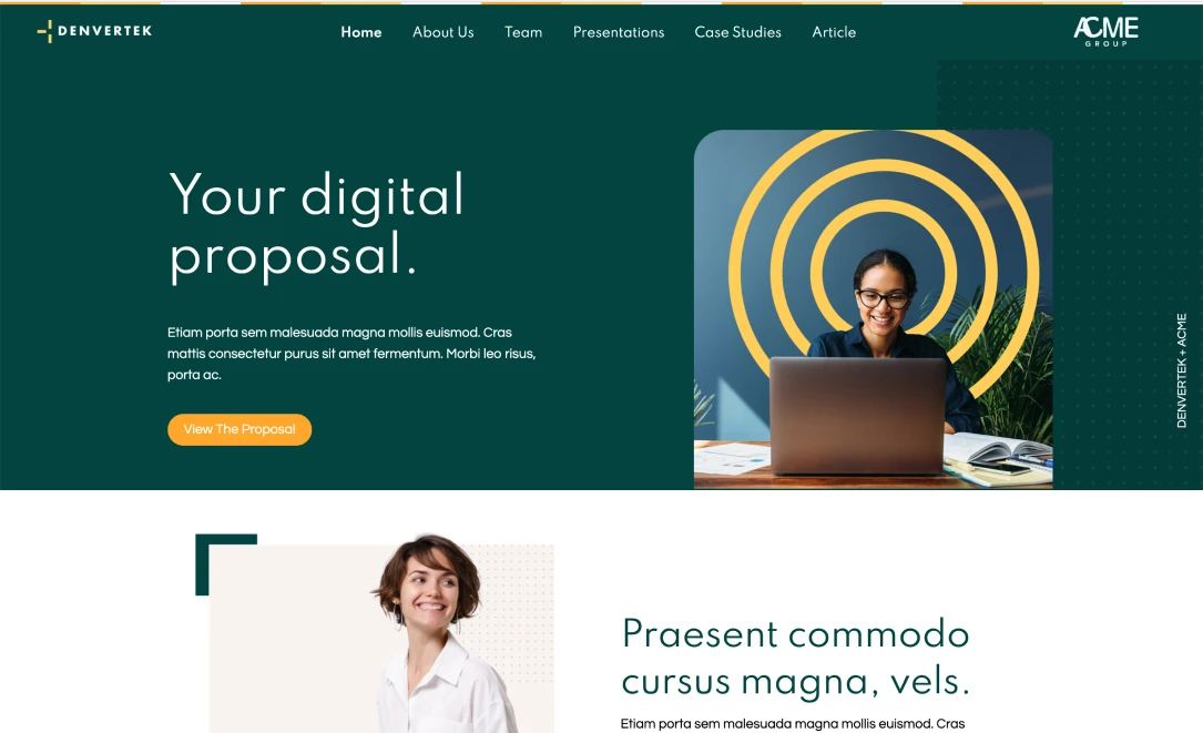
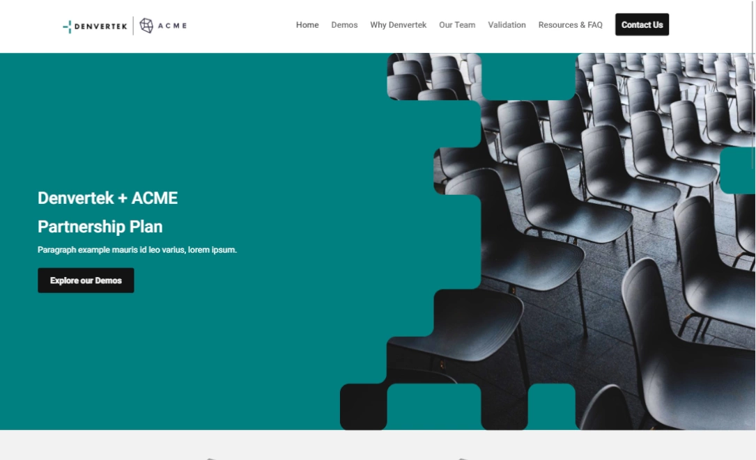
There are a lot of great ego boosts in the business world but perhaps none more enticing than the RFP response (request for proposal).
The upside to receiving an RFP is that there is clear initial interest in hiring your company. The downside is that these have likely gone out to plenty of other businesses that are also hoping to toss their hat in the ring.
In order to stand out among the piles of proposals up for review, there are 5 key mistakes you’ll want to avoid.
Here’s how to avoid these common pitfalls and increase your ROI, by using a microsite to create a customized experience with every RFP you submit.
Mistake #1: talking about yourself
We’ve all gone on bad dates. There’s nothing worse than listening to someone drone on and on about their last vacation, their job and their cute pet chihuahua Curtis. You know who always gets a second date? The person that continues to navigate the conversation back and forth.
It’s the same thought process for a great RFP response. Don’t make it just about all the great things you’ve done for clients, talk about your potential client’s challenges and present some clear ideas on how your company can help them. Here’s where a microsite is beneficial — your client can choose to read more about your company accomplishments or opt to skip over that section to see what your company can do for them specifically.
Show you’ve done your homework by using some of your potential client’s branding within the RFP, including colors and fonts to display your knowledge of who they are. The more customized details you can add, the more your RFP will stand out.
You can use subheads throughout the microsite to speak to the problems your client needs to solve and how you can help them navigate it.
Show you’ve done your homework by picking out some relevant articles and case studies that are relevant to their business and goals to link within your microsite.
And if we’re going for third date territory, customize links and URLs for an added personal touch.
Mistake #2: being too basic
There’s going to be a lot of humdrum PDF’s circulating on your potential client’s desk. Elevate your proposal by including engaging supplementary material on your accompanying microsite.
There’s a tendency to be wordy on a PDF, but with a microsite you can adapt your information and design based on how clients scan websites.
Studies show that online users read in an ”F” formation, first horizontally, then usually across the upper part of the content area. Make sure you use succinct messages, beautiful visuals and graphics whenever necessary so that a quick scan is all it takes to get your points across.
Bring information to life with graphics that are high-resolution and sized correctly for a website, along with videos that will grab their attention.
Mistake #3: the fear of white space
If you can craft concise messaging and live comfortably within the white space on the page, your client will thank you for it.
Just because there’s space on a page doesn’t mean you need to fill it. If you do find yourself needing to convey a lot of information, think carefully on how it can be organized on your site.
The beauty of a microsite is that there can be as many pages as you’d like, so a clear navigation with easy-to-read information and compelling subheads will make it easy for clients to scan and digest all the relevant information.
Make sure calls-to-action are prominent and give your audience clear guidance to what they’re clicking.
Oh and don’t go nutso in the Adobe Stock library. Use images that add value to your RFP response, not ones that simply take up space.
Mistake #4: assuming your client will just “get it”
“Our team has the bandwidth to create favicons in a fixed-width layout all while monitoring your link farm and permalinks on your custom URL.”
Say what?
Be clear in your messaging. Avoid terms that you may use internally but that might not be second nature to your potential clients.
And even though site navigation may be obvious to you, offer a search bar feature so clients can easily access articles or web pages.
Use a video or cool infographic to explain exactly what your company does, rather than assume your client has done all their homework and knows exactly how you work. The RFP is supposed to sell you to them, so don’t assume they’re already in.
You’ve also got to surmise that your client won’t just be reading sample RFP responses on a computer, but also on their mobile device. Make sure your design is responsive so it looks slick from laptop to phone to tablet.
Mistake #5: being the tortoise, not the hare
A major pitfall can be waiting too long to submit an RFP because you’re starting from scratch each and every time.
The ease of a microsite is that once you have a template you love, you can recreate it and then easily customize it for each potential client going forward.
It can take seconds to get a new microsite up and then use drag-and-drop features to add in your client’s logo, some custom graphics or links to relevant news articles.
You’ll find that you’re more agile in being able to respond to these requests in a timely manner rather than waiting on presentation assets.
Put some positive juju out there and build out extra content in advance of being hired so that as soon as your client is ready to start working with you, simply unhide pages or content that can go live with the push of a button.
And bonus! You can make changes on the fly without having to wait for technical support or a graphic designer.
Nail your next request for proposal by sticking to the golden rules: make it about your client, enliven your content and messaging, be clear and concise and invest in a microsite template that will make it easy for you to submit it quickly.
Create interactive, trackable and secure sales proposals with Zoomforth.


